Gauge Widget
The Gauge widget displays a selected report dataset as a gauge-style visual. Use it when a single metric should be read quickly as progress, status, or intensity.
Inputs and Controls
| Control | Description |
|---|---|
| Data set | Select the report dataset used by the gauge. |
| Title | Label shown above the gauge. |
| Description | Supporting text shown with the gauge. |
| Minimum and maximum values | Define the displayed value range. |
| Warning and success values | Set threshold values for gauge states. |
| Needle style | Choose pointer, slim, line, or rounded. |
| Gauge colors | Set low, medium, high, and needle colors. |
Tips and good uses
Tips
- Use gauges for one important metric at a time.
- Keep nearby labels clear so the value has context.
- Consider Target widgets when goal comparison is more important than visual status.
Good uses
- Progress toward a goal
- Cost or revenue status
- Conversion level at a glance
- KPI monitoring
Configuration and Usage
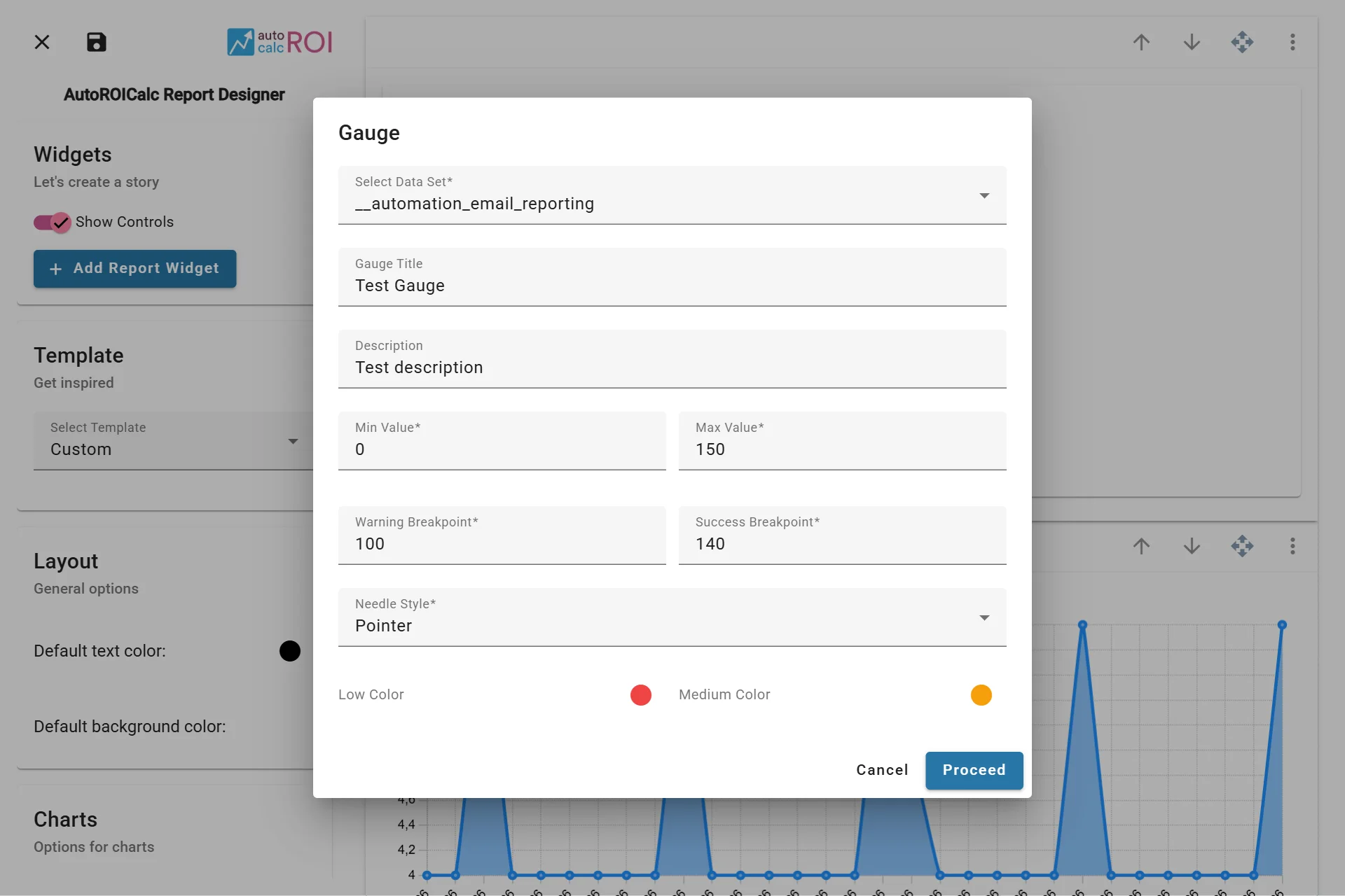
Configuring the Gauge Widget
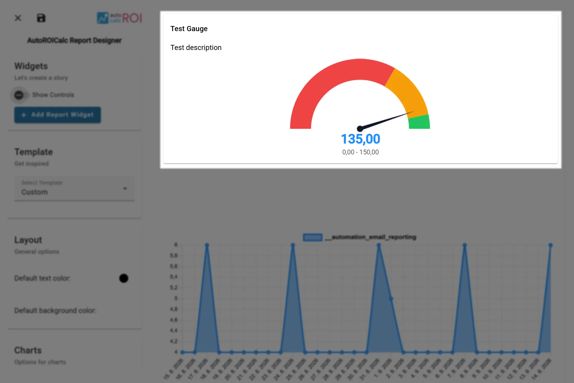
A sample usage of the Gauge Widget