Report Customization
AutoROICalc reports can be customized so the final report view matches the context where it will be used. A report can stay simple with the default layout, or it can use the advanced layout designer for a more presentation-ready view with custom colors, chart styles, layout templates, and widget settings.
Customization is useful when reports are shared with clients, added to dashboards, prepared for recurring updates, or used as an internal reporting workspace.
Customization Levels
Report appearance can be adjusted at several levels:
| Level | What it controls |
|---|---|
| Report layout | Whether the report uses the default layout or the advanced layout designer. |
| Layout template | A starting visual style for the advanced report layout. |
| Global report appearance | Common colors and chart styling used across the report. |
| Widget configuration | Individual widget content, display mode, thresholds, colors, filters, and layout behavior. |
Global Appearance Settings
In the advanced layout designer, the report can have shared appearance settings that apply across the layout.
Common layout settings include:
- Default text color
- Default background color
- Chart grid color
- Chart legend font color
- Chart scale font color
- Chart grid dash style
- Chart grid line thickness
- Chart legend font size
- Chart scale font size
- Chart line thickness
These settings help keep the report visually consistent without editing every chart or widget separately.
Report Backgrounds and Colors
Reports can use a custom background color in the advanced layout. This is helpful when a report needs to match a brand style, separate itself from the default app surface, or use a dark or high-contrast presentation.
The default text color can also be adjusted, which helps keep section text, labels, and other report content readable against the selected background.
Keep readability first
Strong colors can work well for dashboards and client-facing views, but make sure text, chart labels, and KPI values still have enough contrast.
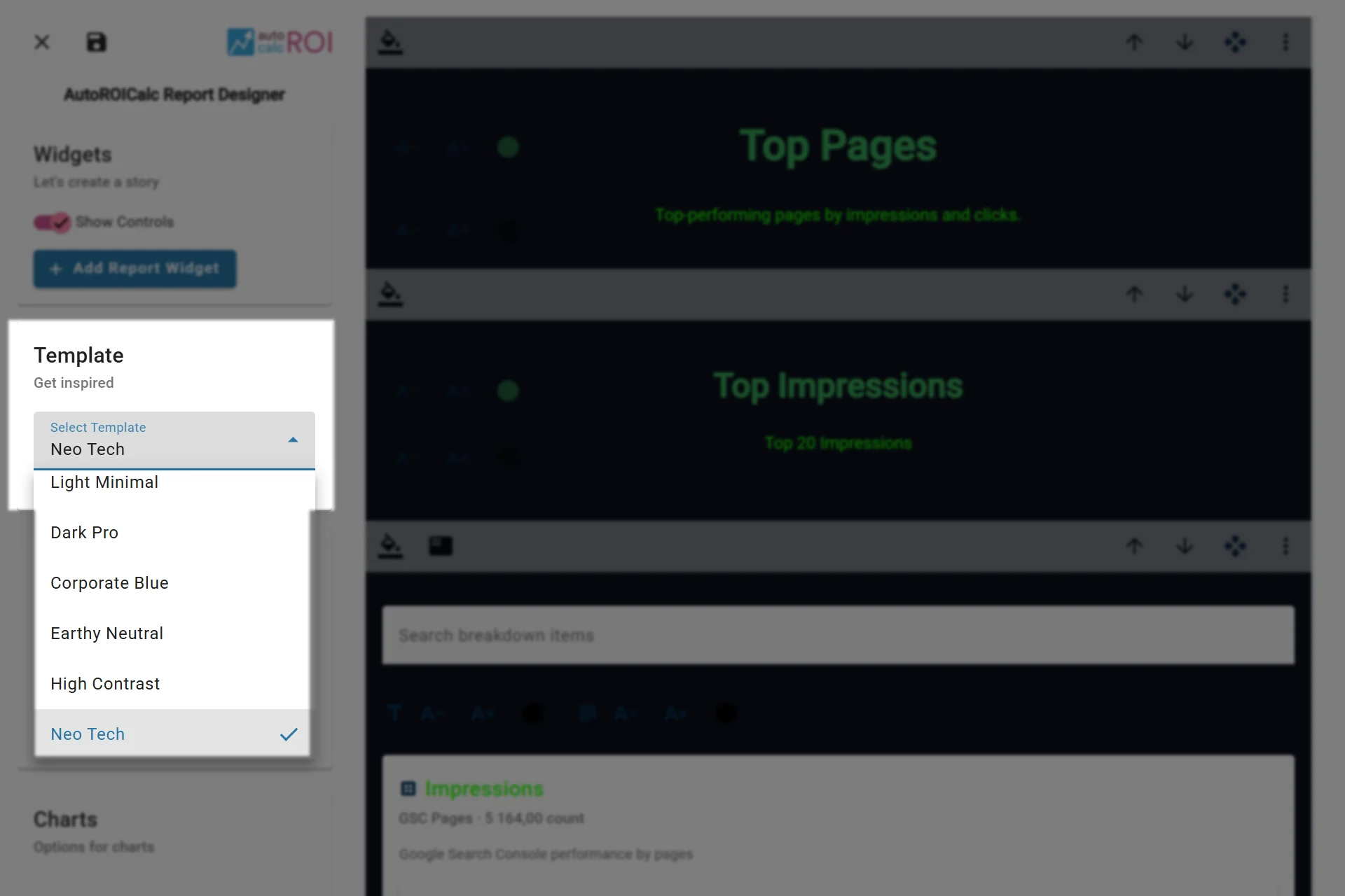
Choosing from pre-defined Report appearance templates
Chart Styling
Chart styling can be adjusted globally for advanced report layouts. This includes the grid, axis labels, legend text, and line thickness used by chart widgets.
Use chart styling when:
- The report needs to match a brand or presentation style.
- The default chart grid is too strong or too subtle.
- Legend or scale labels need better contrast.
- Line charts should appear lighter or more prominent.
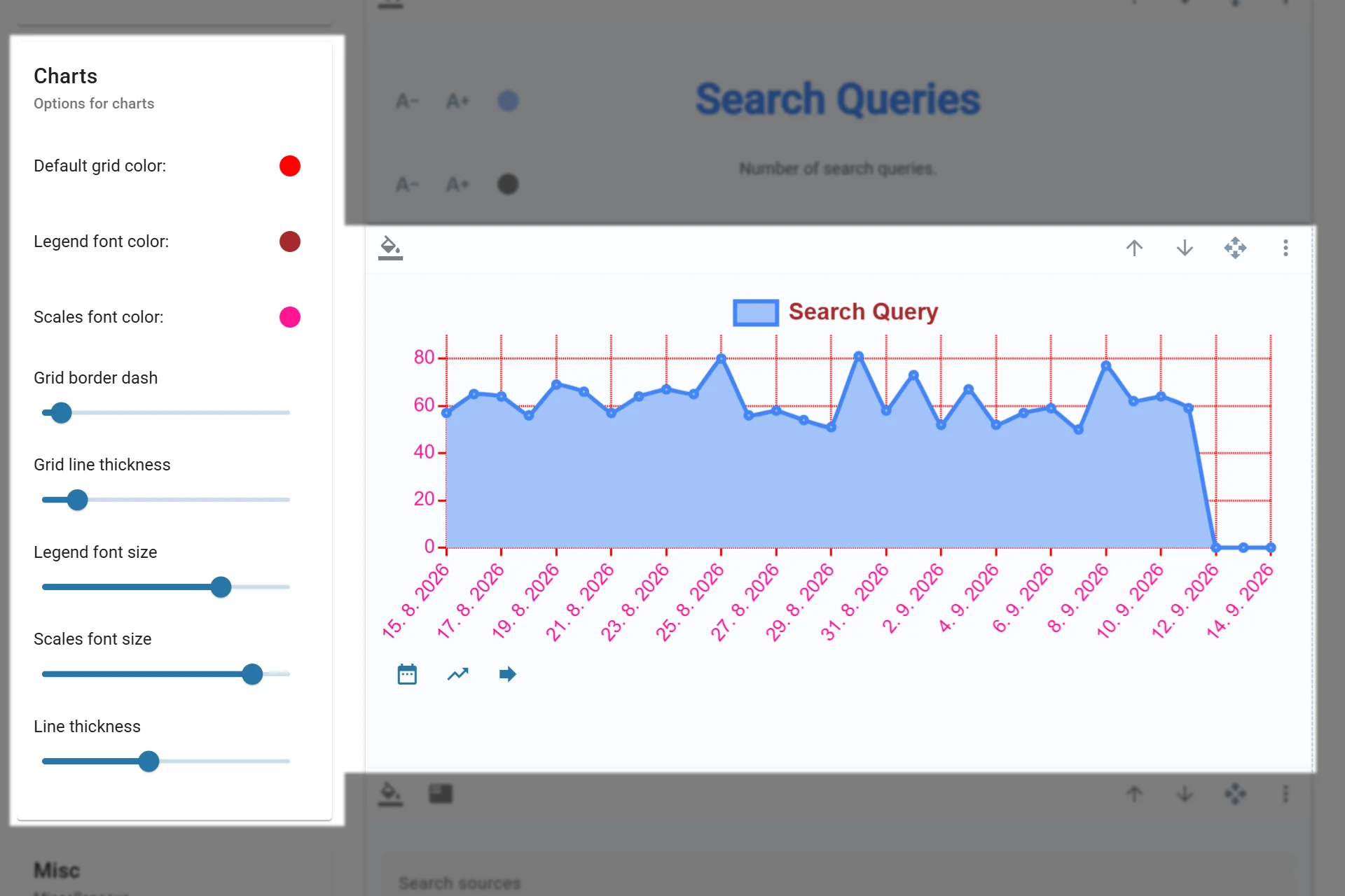
Adjusting chart appearance
Widget-Level Customization
Particular widgets can also be customized through their own configuration dialogs. The available options depend on the widget type.
Examples include:
- Section widgets can set text, font size, and alignment.
- Image widgets can control image fit, position, alignment, and height behavior.
- Chart widgets can choose chart type and selected datasets.
- Gauge widgets can define thresholds, needle style, and colors.
- Target widgets can set a target value, chart type, and value display size.
- Contribution Mix widgets can define items, colors, icons, and chart appearance.
Widget-level settings are useful when one part of the report needs a different emphasis than the rest of the layout.
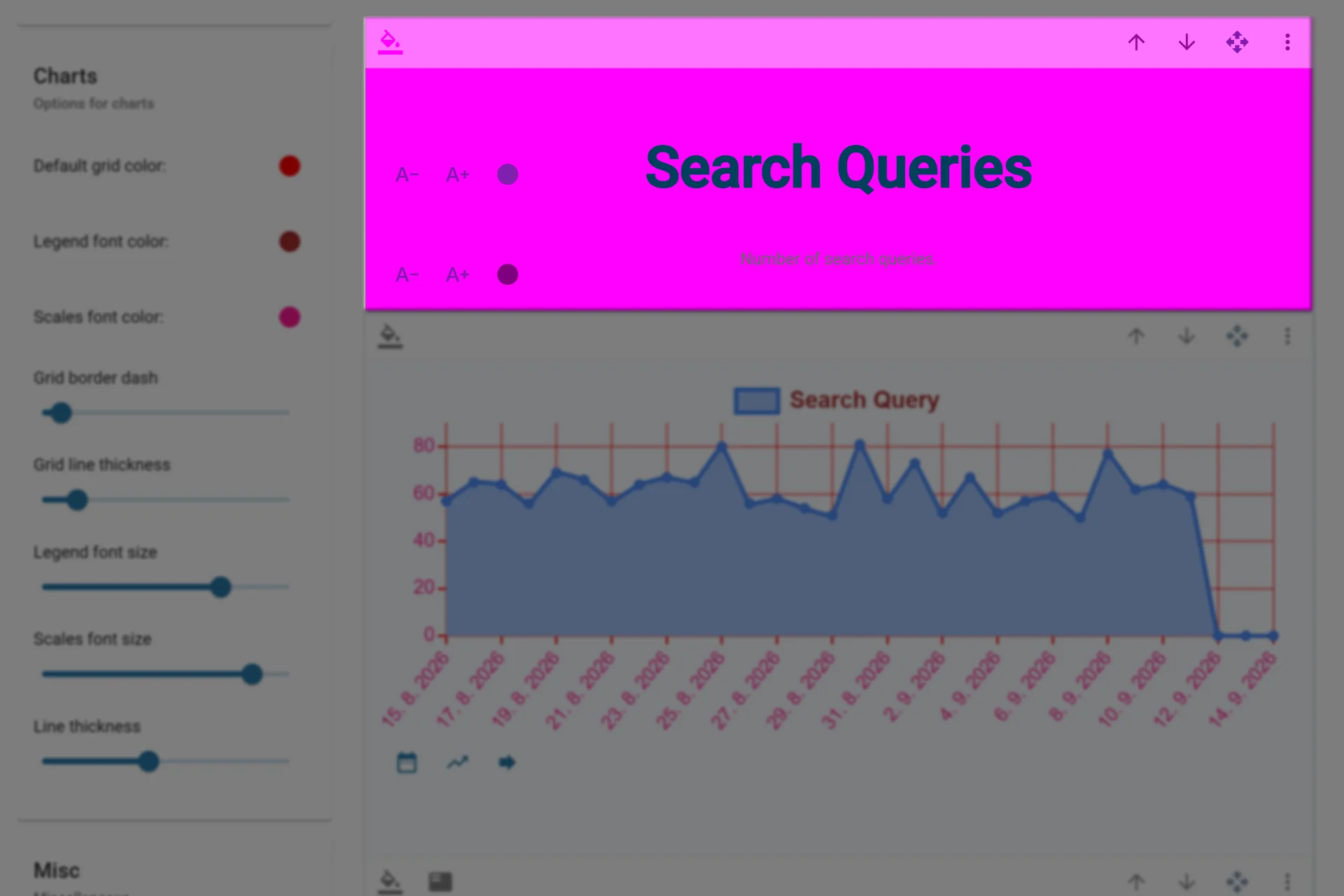
Adjusting widget appearance
Templates as a Starting Point
Advanced report layouts can start from a template. Templates provide a quick visual direction, then you can adjust colors, chart settings, widgets, and placement as needed.
Use templates as a starting point rather than a fixed design. They are especially useful when creating several reports that should feel consistent.