Chart Widget
The Chart widget shows report data as a visual chart. Use it for trends over time, comparisons between report items, and high-level visual reporting.
Inputs and Controls
| Control | Description |
|---|---|
| Chart type | Line, bar, pie, or doughnut chart. |
| Filter report datasets | Limit the chart to selected report datasets. |
| Dataset selection | Choose visible datasets when filtering is enabled. |
| Adjust items order | Enable manual ordering of displayed datasets. |
| Dataset order | Drag and drop datasets into the desired display order. |
Tips and good uses
Tips
- Match the chart to the report time base.
- Avoid too many datasets in one chart.
- Use clear report item names before adding charts.
Good uses
- Costs over time
- Leads or sales by day, week, or month
- ROI trend lines
- Comparing multiple report items in one chart
Configuration and Usage
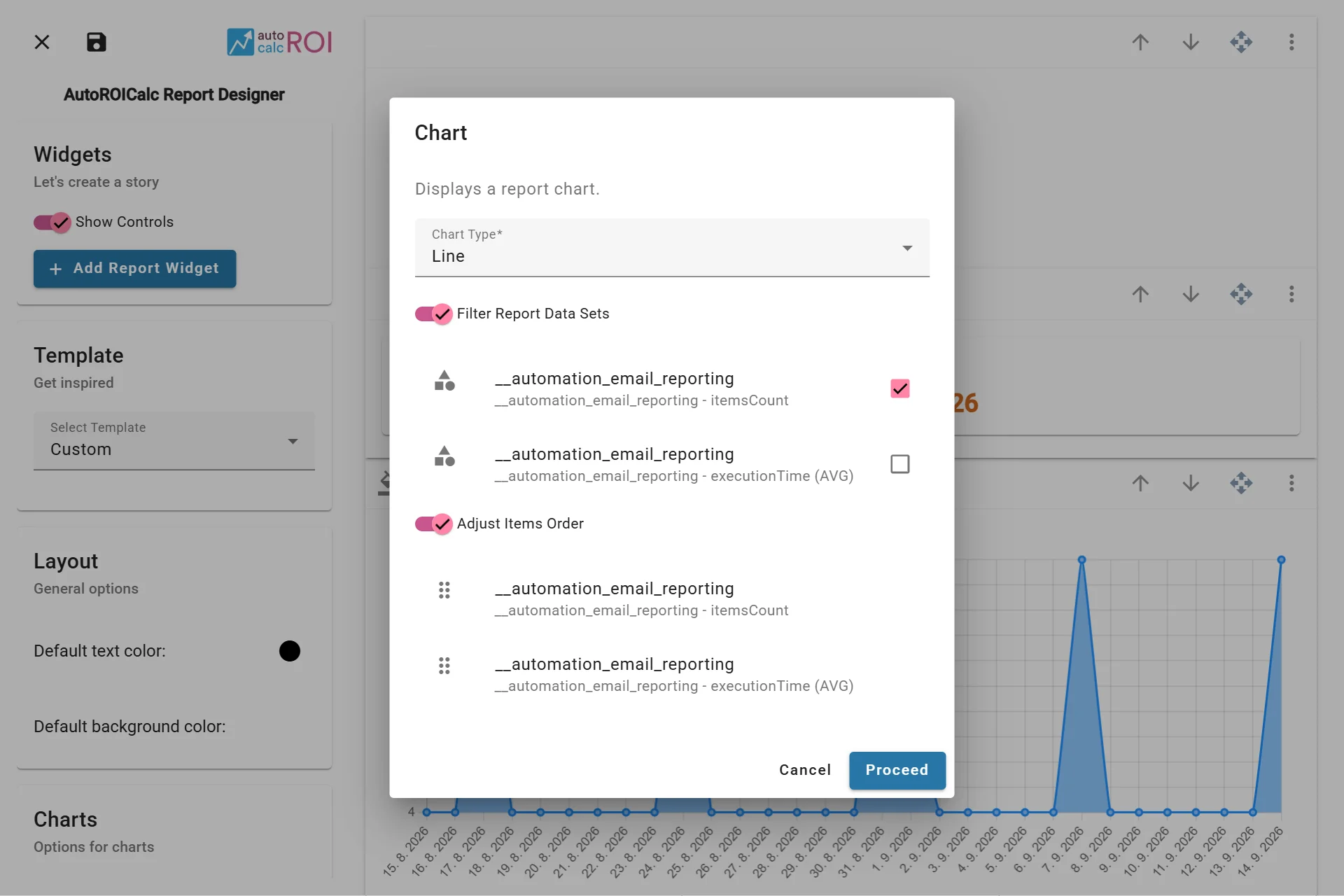
Configuring the Chart Widget
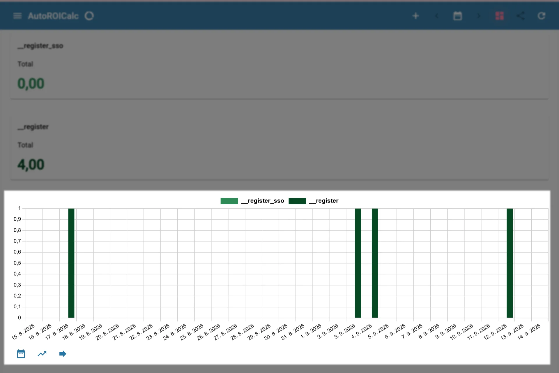
A sample usage of the Chart Widget