What is forecasting in the meaning of data and charts? It is the process of making predictions based on historical data. There are many forecasting methods, for example straight-line, moving average, simple linear regression, or multiple linear regression. But we are good with the moving average method at this moment.
Moving the average…
This method takes an average of a historical set of numbers in a given range while moving the range. Sounds like rocket science stuff? Not on our terms 🙂
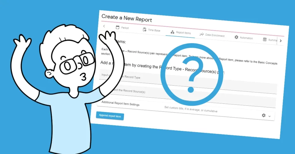
On how to forecast

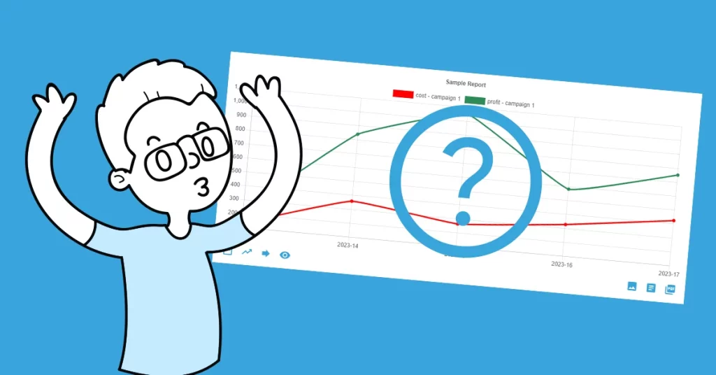
In the AutoROICalc Report Chart view, find the third left item at the bottom of the chart, titled “Forecast”. A simple dialog will be shown. Pick the “Moving Average” forecast method, the number of average periods of the historical data, and the number of forecast periods. See the example dialog below.

When ready, hit the “Apply” button and enjoy your new item in the chart.
Ready to wow your clients?
A forecast using a moving average could be useful in case of getting an idea of what could happen next. It is also helpful in estimating the trend cycles. To get a better understanding of your data, why not also add a trendline to your charts to wow your clients even more?

Flexible analytics & reporting without BI complexity
Unify your data, build custom metrics, and automate dashboards and reports — all in one platform.
Unified and Consistent Data Layer
Aggregate and structure data from multiple platforms into one reliable, analytics-ready environment.
Flexible Data Management
Manage your data manually or automatically with powerful tools for synchronization, updates, and transformations.
Accessible Anytime, Anywhere
Your dashboards, reports, and data remain accessible across devices — always under your control.
Custom Analytics & Automated Reporting
Define your own KPIs, build custom dashboards, and automate reporting workflows across your organization.
Set Once, Enjoy Forever!
Start your free 30-day trial and explore all features.
Explore the pricing plans. No credit card is required.