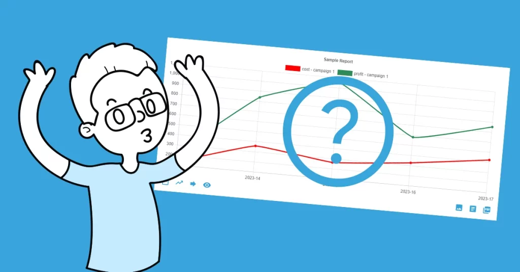
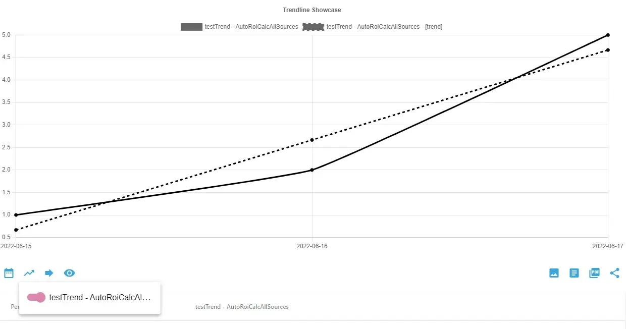
Trendline: What it is, what does it mean? Briefly, a trendline is a line placed on a chart showing the overall direction of the particular data. There are various types of trendlines, for example linear, polynomial, or exponential. In the terms of AutoROICalc, the linear trendline is our point of interest.
Rising, declining, or stagnating?
These are the three states the linear trendline helps us to determine. The purpose of the linear trendline in an AutoROICalc chart is to immediately see if you are doing great or not. This helps you to take the relevant action. If there is a chance, take a glance at our Best Practices article to get some more information about these three states.
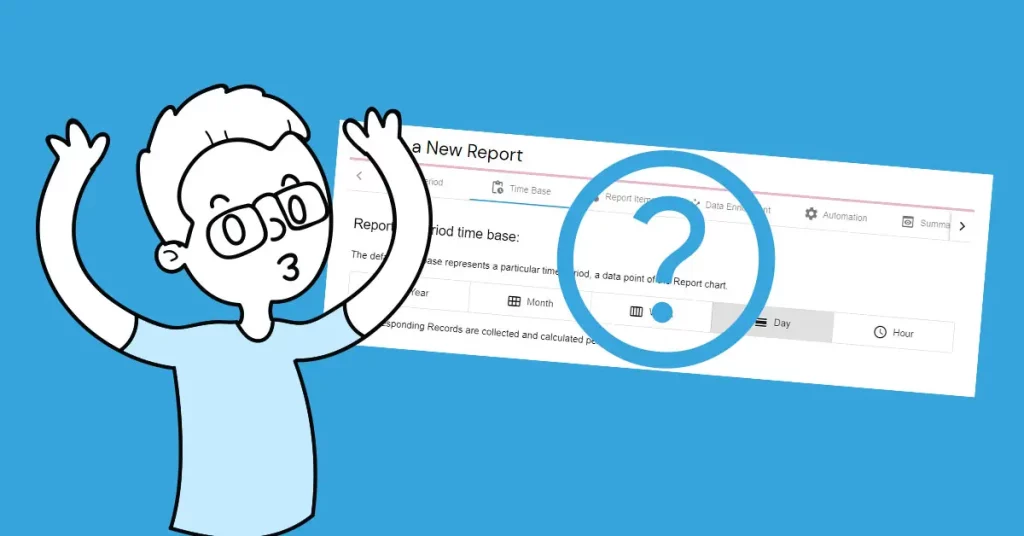
How to add a trendline to the AutoROICalc chart?

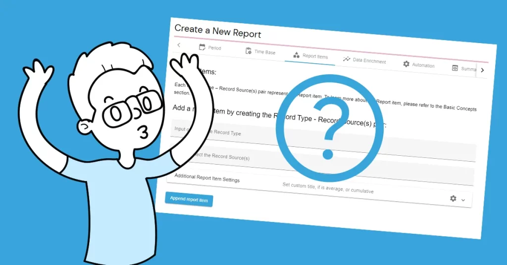
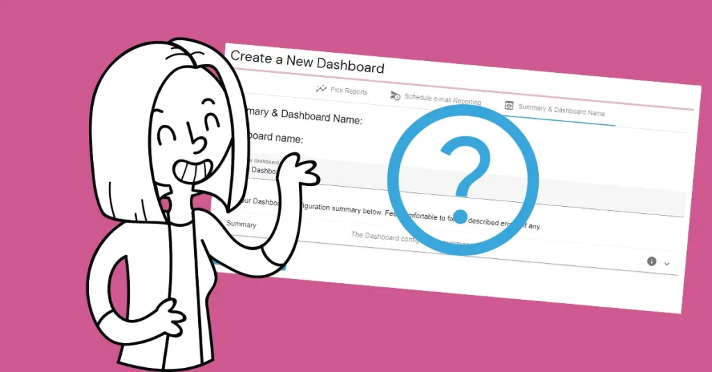
In the AutoROICalc Report Chart view, find the second left item at the bottom of the chart, titled “Trend Lines”. A menu with the Report items will be shown. Check the desired Report item to calculate and add the trendline.
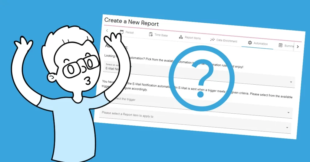
Want to be notified, when a trendline slope is changed?
As far as you know, our philosophy is that we do the data collection and reporting stuff in the best possible elegant way with the least effort from your side and according to the Report, you take the action to keep your business or activities growing.
AutoROICalc now offers automation in the form of email notifications when a trendline slope of your chart items is changed. This will also help you to stay on track.
Experience it now
Linear trendlines of your Report items are a matter of course. Email notifications and other Report automation are Premium features. But still, experience it now with a 30-day free trial!
Flexible analytics & reporting without BI complexity
Unify your data, build custom metrics, and automate dashboards and reports — all in one platform.
Unified and Consistent Data Layer
Aggregate and structure data from multiple platforms into one reliable, analytics-ready environment.
Flexible Data Management
Manage your data manually or automatically with powerful tools for synchronization, updates, and transformations.
Accessible Anytime, Anywhere
Your dashboards, reports, and data remain accessible across devices — always under your control.
Custom Analytics & Automated Reporting
Define your own KPIs, build custom dashboards, and automate reporting workflows across your organization.
Set Once, Enjoy Forever!
Start your free 30-day trial and explore all features.
Explore the pricing plans. No credit card is required.