A useful marketing dashboard should answer more than “did revenue go up?” It should show what was spent, what came back, and where the results came from. This walkthrough uses fictional records that you can import into AutoROICalc and reuse in your own test account.
The file contains six records per day for 28 days (168 records total), from 24 August to 20 September 2026. It includes Google Ads and email costs, attributed revenue, and conversions. The records also carry structured breakdowns for campaigns, countries, devices, and products. No customer or business data is included.
1. Import the sample records
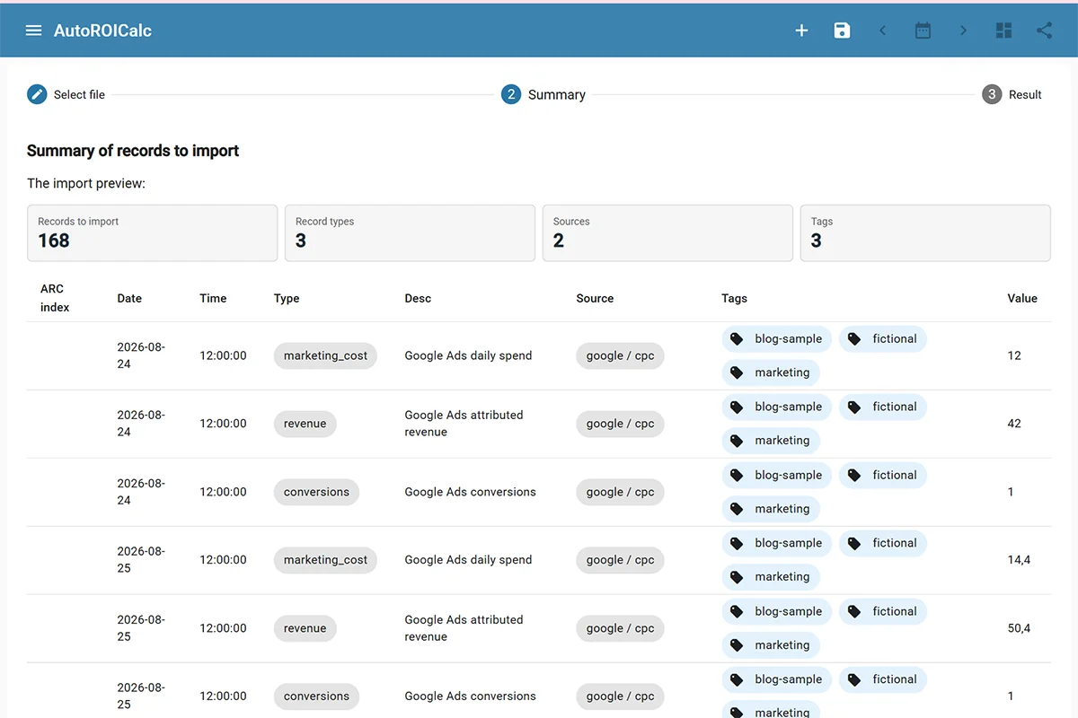
Open Records → Import from ARC, select the downloaded file, and review the import preview. You should see 168 records, three record types, two sources, and the blog-sample tag. Complete the import and check a few records in the list. Open a revenue record to see its custom breakdown data.
ARC is AutoROICalc’s native record export format. It preserves the structured custom data that the breakdown widgets use, which makes this example easier to reproduce than a flat spreadsheet import.
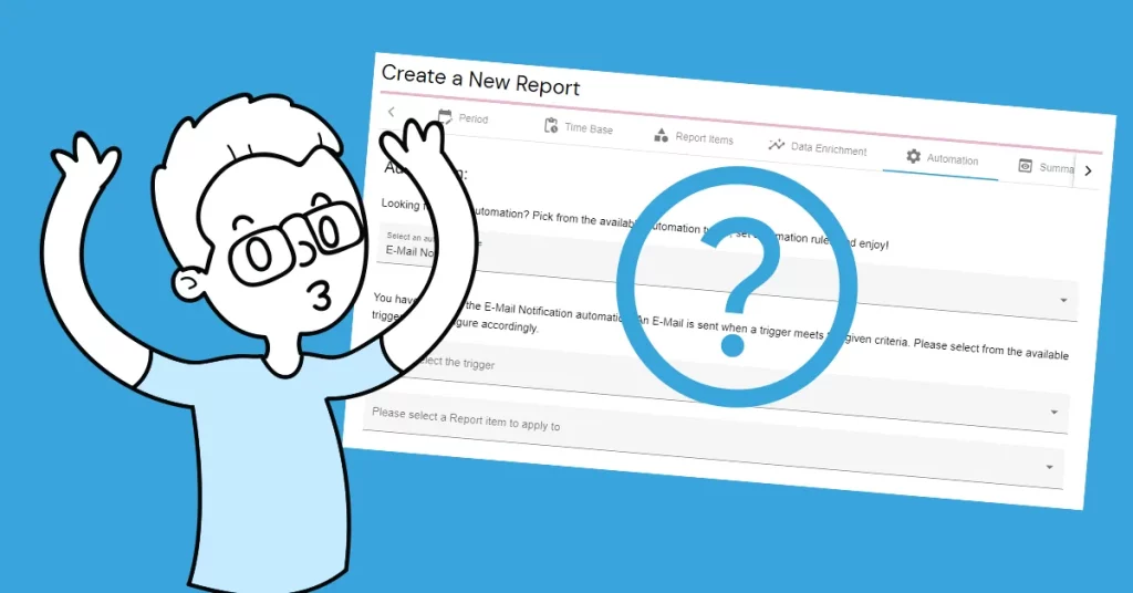
2. Create a performance report
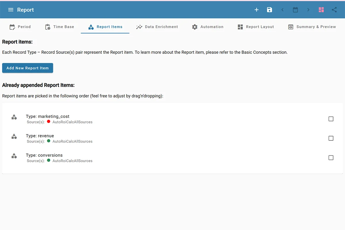
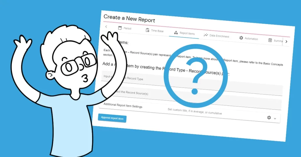
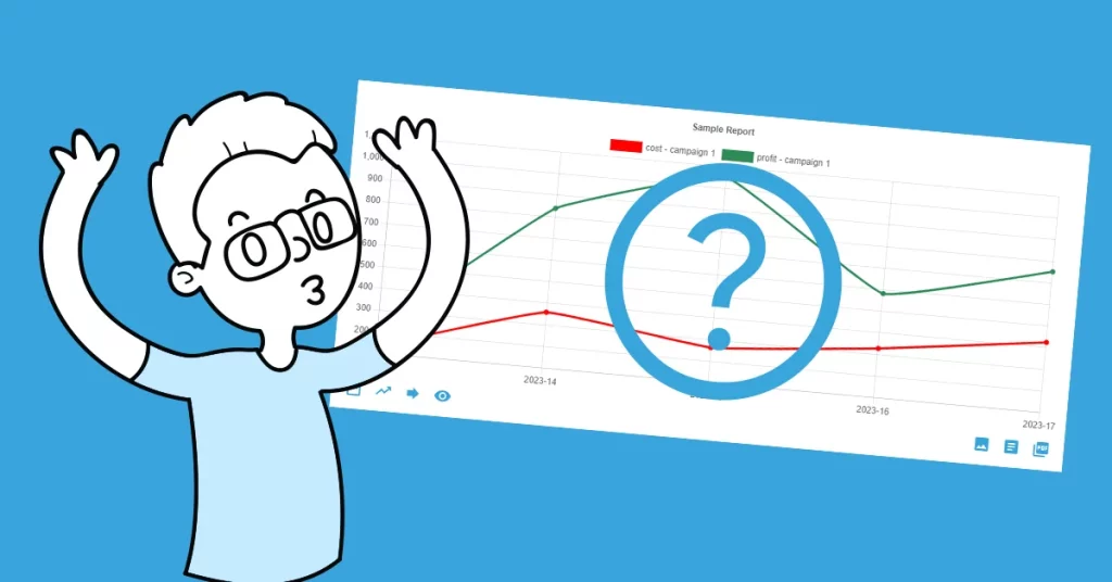
Create a new report using the fixed period 24 August–20 September 2026 and a daily time base. Add report items for the marketing_cost, revenue, and conversions record types. Include both sources when you want an overall view; create separate source-specific items when you want to compare Google Ads with email.
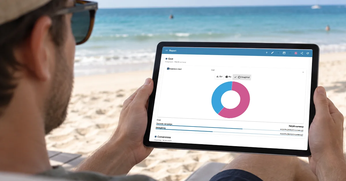
Before adding a layout, check the report’s totals. Across both sources, the sample has 760 in cost, 3,120 in revenue, and 52 conversions. These figures are fictional; their purpose is to make the tutorial verifiable.
3. Add the breakdown views
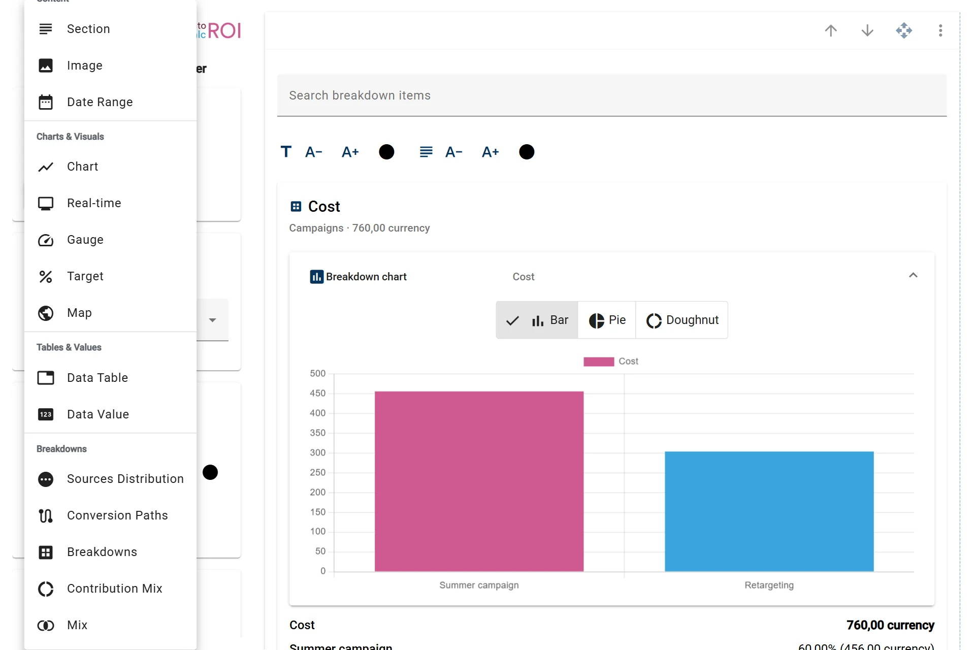
In the report designer, add a Breakdown widget and select a breakdown such as products or devices. Choose the revenue metric, then set an item limit and sort order that make the result easy to scan.
Add a Map widget for the countries breakdown. Choose revenue as the metric and country as the country attribute. The sample uses the country codes SK and CZ, so the map can group revenue by Slovakia and Czechia. A data table beside the map gives readers exact values that are harder to read from a color scale.
Campaigns use the cost metric, while products and devices use revenue. Keep the metric aligned with the question each widget answers.
4. Turn reports into a dashboard
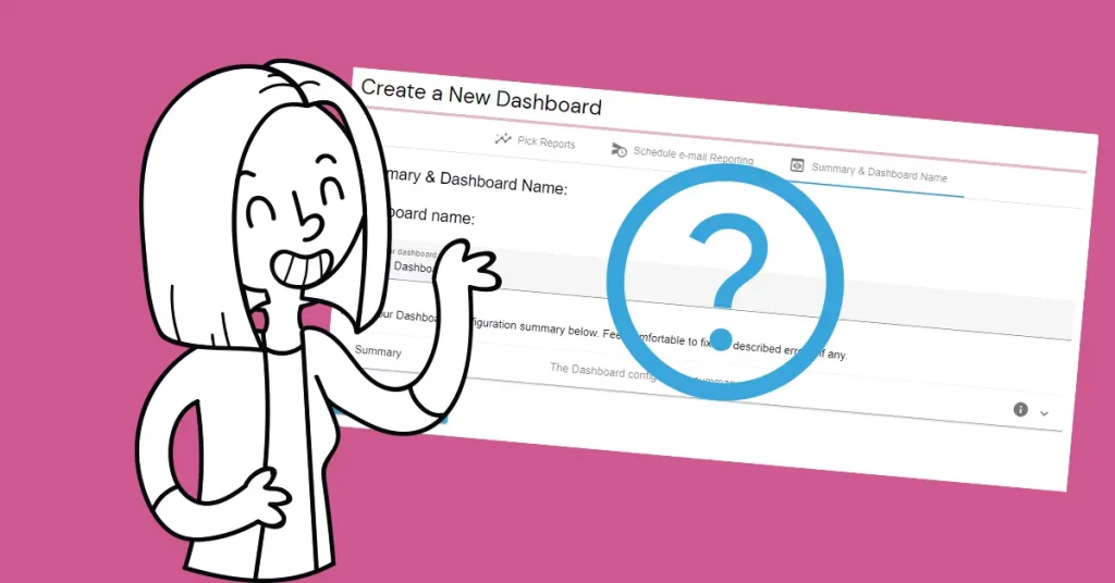
Save the report, then create a dashboard and add it. You can add a second source comparison report or a focused country report later. Arrange the reports in the order a reader would use them: overall performance first, then the details that explain it. Give the dashboard a clear name and a tag so it is easy to find again.
The finished dashboard is a reusable starting point. Replace the fictional records with your own imports or integrations when you are ready to track real performance.
For more details, see: